AceMedia's Portfolio
These of course aren’t everything we’ve done, but all of them are pieces our customers were particularly fond of. From marketing pamphlets to social media ads, look below to see what AceMedia can do for you!
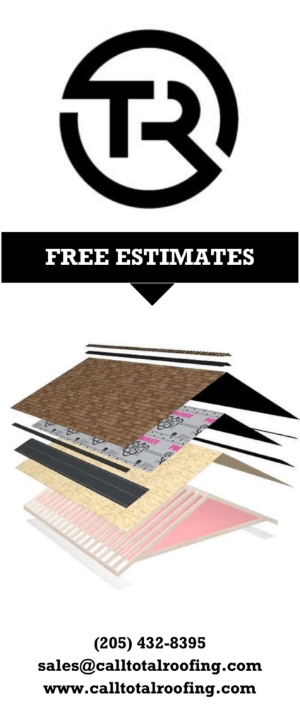
Front
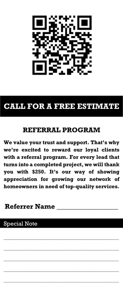
Back
Total Roofing wanted to up their door to door sales game, and as such needed a good-looking pamphlet to charm their customers. They wanted a QR code on the back for people to scan for information about their referral program, and a spot at the bottom where they could write each of their customers a special note. On the front, they didn’t want anything too flashy, since they would be there to explain their services for the customers.
Total Roofing was doing a 4th of July giveaway and wanted to make an advertisement for it. They asked us to make a simple flier with the giveaway prize, a Yeti cooler, as well as their own logo and how to participate, along with some 4th of July celebratory fireworks in the background.


Total Security’s old logo wasn’t awful, but it certainly wasn’t brandable. This is actually the version we cleaned up for them; they had one that they downloaded off the web and used as a reference. Once they saw how this one looked, they decided they wanted something a little more professional-looking, so they asked us to use our graphic design skills to make a sleek new logo for them. They use this as the badge on their uniform now.

Since Total Security is, as it’s namesake suggests, a security company, we decided to use motifs that would support that fact. The T is meant to look like the hilt of a sword, meant to symbolize swift responses to anything that goes on during their shifts, and the shield of course symbolizes security and safety in general. Finally, the owner wanted to have a maroon and gray color scheme, which works quite well against both a black and white backdrop.
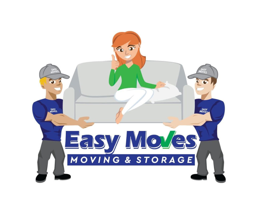

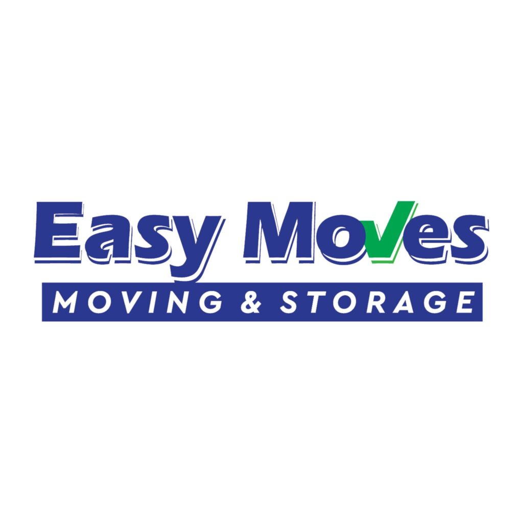
Easy Moves Moving & Storage’s old logo (pictured left) was adorable, but it was pretty bad for a company logo. They decided to keep it for promotional material, but they wanted to slim down the design. They asked us if we could give our opinion on how to make their logo more professional looking, and the finished result (pictured right) was our answer. We simply kept the part under the couch in the old logo and made that their brand. It looks great on paperwork, their shirts, and as their website’s logo – wins across the board. This example shows that it doesn’t always have to be a major change to be a good change.
AceMedia
321 Applegate Pkwy, Suite D
Pelham, AL, 35124
(205)-440-3953
